Unlocking Market Insights: Mastering Data Visualization with YChart's Powerful Tools
In the dynamic world of finance and investment, having access to precise and timely market insights can make all the difference. Have you ever felt overwhelmed by the sheer volume of data at your fingertips? How do you sift through this information to make informed decisions? This is where YChart steps in, transforming data into actionable insights that you can leverage for financial success. With its powerful data visualization tools, YChart allows you to interpret both financial and economic data seamlessly, making it a staple for investment analytics and portfolio analysis.
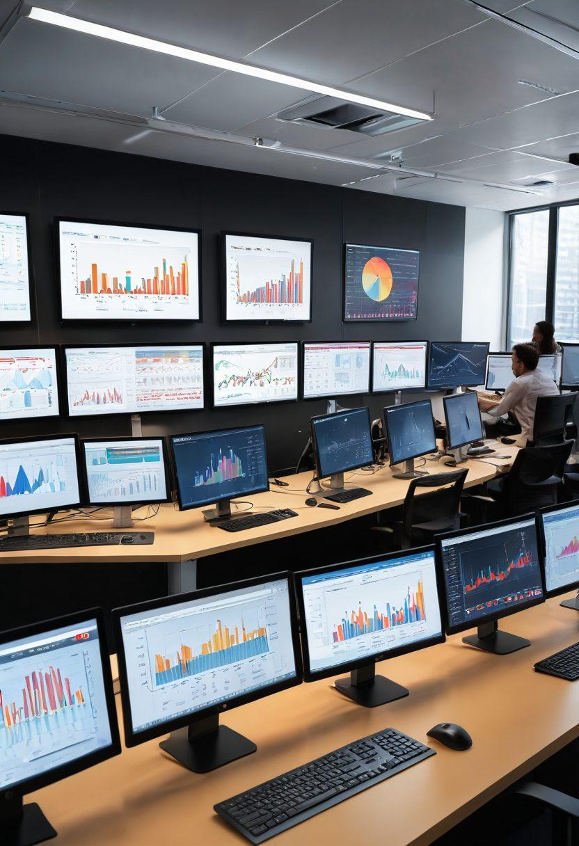
Imagine standing at the edge of a vast ocean of data without knowing how to swim. That’s how many investors feel when faced with complicated spreadsheets and raw figures. Thanks to YChart’s innovative charting tools, you can turn the tide. Say goodbye to guesswork and hello to clarity—YChart enables you to create stunning visual representations of financial data through user-friendly interactive charts. From complex performance metrics to straightforward statistical charts, these visuals help you understand market trends swiftly and effectively, paving the way for superior investment strategies.
If a picture is worth a thousand words, then what is a chart worth in the realm of financial data? It’s invaluable! Visual analytics is blurring the lines between ordinary data interpretation and insightful decision-making. With YChart, not only do you get access to thousands of data sources, but you also gain insights through innovative data dashboards that showcase real-time data and trend analysis. Are you preparing for an important investment? YChart has got you covered with its customizable graphs that make market analysis not just engaging but also informative.
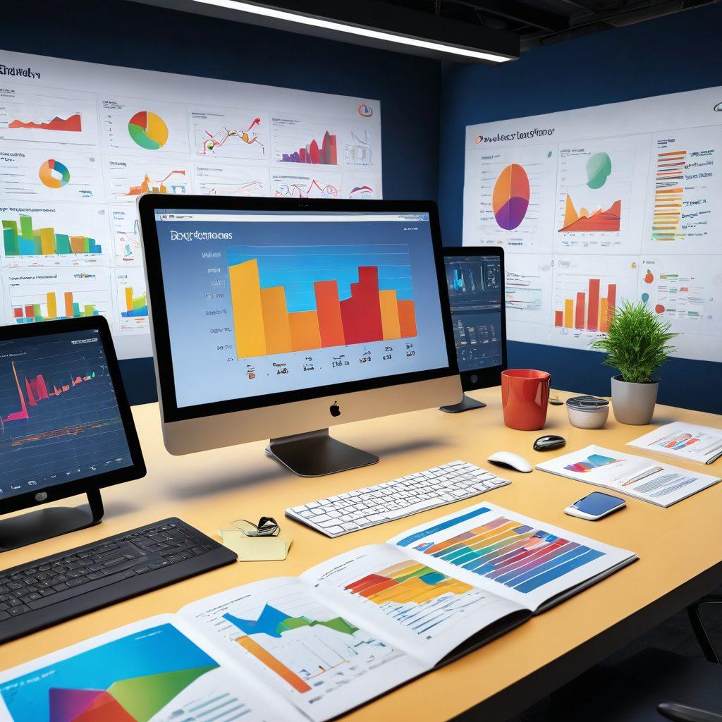
YChart’s appeal lies in its ability to transform complex data representation into visual storytelling that resonates with you. Picture this: you’re analyzing market trends to decide on the best investment strategy. Instead of feeling bogged down by numbers, you see sleek financial charts that highlight key growth metrics, risk assessments, and potential opportunities. This clarity isn't purely aesthetic; it translates to smarter business analytics—enabling you to make quicker, more informed decisions, while also impressively showcasing your findings to stakeholders.
So, how do you harness the power of YChart for enhanced data visualization? Start by exploring its diverse charting solutions tailored for your specific needs, whether for financial modeling or business intelligence. Dive into real-time data to keep your finger on the pulse of market insights that affect your investments. Engage with the platform’s advanced features to achieve a higher level of data analysis and unlock the potential of effective portfolio analysis. Are you ready to take that step forward? Your journey towards mastering data visualization with YChart has just begun, and the opportunities are limitless!
Visualize Success: How YChart Enhances Your Market Analysis Journey
Imagine holding the keys to a treasure trove of market insights, equipped with tools that turn raw data into a compelling narrative about your financial future. In today's fast-paced business environment, understanding market trends through effective data visualization is no longer a luxury but a necessity. Enter YChart, a powerful ally in your journey of market analysis. This innovative platform elevates your data representation game with stunning graphical data analysis, making it easier than ever to uncover the stories hidden in your financial data.
YChart shines in providing a truly interactive experience, allowing users to craft financial charts and interactive charts that bring economic data to life. Picture yourself analyzing investment strategies with the clarity and precision that only YChart can provide. The platform’s intuitive charting tools transform complexity into simplicity, allowing both novices and experts alike to engage in real-time data exploration. Ask yourself, how would your portfolio analysis improve if data dashboards reflected your personal vision of success?
A recent satisfied user shared, 'Using YChart has revolutionized the way I approach market analysis. I can visualize market trends, unpack my performance metrics, and execute sound investment strategies all in one place.' This transformation is not just a dream; it’s a reality with YChart’s efficient data analysis tools. By enabling visual analytics, YChart assists in drawing meaningful conclusions that enhance decision-making—a crucial aspect for anyone serious about their financial future.
Think about it: with YChart, your data interpretation evolves. Instead of sifting through endless rows of numbers, you can harness visually engaging statistical charts that highlight crucial patterns and insights. Each graph tells a story, drawing attention to critical areas of interest while making complex concepts accessible. Have you ever been overwhelmed by data, wishing for a clearer path? With YChart’s sophisticated yet user-friendly graphical data analysis, that clarity is just a few clicks away, paving the way for better business intelligence.
Whether you are managing a portfolio or exploring broader market dynamics, YChart provides the necessary tools to visualize success. By offering comprehensive investment analytics and performance metrics, YChart makes it easier to track advancements and setbacks in your strategy. The journey to mastering your market analysis begins with smart data visualization; let YChart be your guide to turning numbers into narratives that lead to actionable insights and impactful decisions. So, why wait? Start transforming your market analysis today!
From Numbers to Narratives: Elevate Your Financial Storytelling with YChart's Tools
In today’s data-driven world, numbers are often just the beginning of the story. Enter YChart's incredible suite of tools that transforms boring spreadsheets into compelling narratives. How often have you stared at complex numbers, yearning for a clearer understanding of what they really mean? What if you could visually tell your tale instead of relying solely on raw data? With YChart, this dream turns into reality as it provides fantastic data visualization options, allowing you to elevate your financial storytelling to unprecedented heights. Just imagine turning tedious data analysis into captivating visuals!
When it comes to conveying market insights, visual representation is king. YChart’s interactive charts and graphical data analysis tools are designed to make understanding financial data fun and engaging. You no longer need to be a data scientist to interpret market trends; YChart equips everyone with the ability to perform dashboard-level data analysis effortlessly. Using charts that are not only beautiful but also functionally rich, users can now unlock deeper insights. Picture this: investors, entrepreneurs, and financial analysts all come together, their eyes lighting up as they interact with real-time data that speaks volumes beyond mere numbers.
Storytelling in finance isn't as straightforward as one might think. For instance, you could present two portfolios - one showing only the performance metrics with no context, and another layered with trend analysis through YChart's exquisite financial charts. Which one do you think will capture the attention of your clients or stakeholders? That’s right! By using effective data representation and business intelligence strategies, you can showcase market analysis that tells a larger story. “A picture is worth a thousand words,” they say, and with the right charting tools, your financial journey will have a far greater impact than a standard report ever could.
Consider this: data visualizations created with YChart not only facilitate better portfolio analysis but also allow for robust investment analytics. Imagine being in a meeting and pulling up a stunning data dashboard to highlight your findings. The dynamic visuals instantly engage your audience while delivering a clear insight into economic data. With these graphing solutions, you're not just presenting; you're connecting and communicating. How empowering would it feel to walk away from a presentation knowing that your data interpretation led to a meaningful conversation about investment strategies?
Ultimately, YChart not only offers you the tools to create beautiful statistical charts—it also enables your audience to connect and engage with your analysis. By transforming financial modeling and market trends into visually appealing materials, you now wield the power of storytelling through data. So, whether you're diving into business analytics or performing advanced data interpretation, the possibilities are endless. Isn’t it time you turned your numbers into narratives? Join the revolution of data visualization with YChart, where your insights become more than just numbers—they morph into stories that truly resonate!